Building Headless Shops With WooGraphQL: Chapter 3 of 5
Geoff Taylor
Jul 19, 2023·1 min read
Heads up: this tutorial covers an earlier WooGraphQL release and is no longer up to date. A rewritten version is in progress — we’ll link to it from here once it’s published.
Welcome to the third part of our tutorial series on creating a headless eCommerce application! This chapter is a step-by-step walkthrough of creating the shop listing pages using WooGraphQL + Next 13. The focus is on implementing a navigation system and a Shop page for your e-commerce platform.
Geoff Taylor
Meh, I code stuff.
Creator of WooGraphQL.
WPGraphQL Enthusiast
Keep reading.
Building Shop Listing Pages with WooGraphQL
We’ll start by creating the shop page with little to no filtering functionality, then finish up by implementing the filtering functionality and updating each component respectively. Without further delay let’s begin!
Part 1: Edit Root Layout
We will first modify our root layout to include top navigation.
The new layout will make use of TopNav from the WooGraphQL server. This will populate the navigation menu with product categories fetched from the GraphQL endpoint. Additionally, we import a Toaster for user notifications and feedback.
2. Create server/TopNav/index.ts:
// server/TopNav/index.ts
export * from './TopNav';
This file is acting as a barrel file, allowing us to import everything from ./TopNav at once, simplifying imports elsewhere in our code. This is a common practice for isolating associated tests and local utility files. Expect this pattern to be used for all components in the /server. Going forward I won’t be displaying the component barrel files with some exceptions.
This file defines our TopNav component, a full-width navigation bar that includes a list of categories (if any) and site branding. In our case in our layout.tsx we are providing the 5 most populated categories.
Part 2: Create Shop Page And Shop Page Server Components
Now, we’ll create a Shop page where products can be listed.
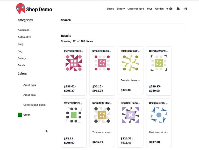
The new implementation fetches products, categories, and colors from our GraphQL endpoint and displays them using the Shop component. This component is responsible for rendering a full product list, categories, and color filters.
2. Create the Shop component /server/Shop/Shop.tsx:
The Shop component displays a sidebar with categories and color filters and a main area with a search bar and product listing. It makes use of several child components, which we’ll create next
The ShopSidebar component provides sheet-style side navigation for mobile views by utilizing another shadcn/ui component. It collapses into a button and expands when clicked, revealing its children (categories and color filters). On larger screens, the sidebar is always visible.
Part 3: Create Shop Page Client Components
1. Creating the barrel file for a client component /client/ShopCategories/index.ts:
// client/ShopCategories/index.tsx
'use client';
export * from './ShopCategories';
Similar to the server components barrel file with the exception of 'use client'; at the top of the file.
The ShopCategories component takes the fetched product categories and lists them in a scrollable list. Each category is clickable, but the link is not yet functional.
The PaColorPicker component renders a list of color filters using the color data fetched from the GraphQL endpoint. Each color is represented by a ColorSwatch and the color’s name. Similar to the categories, the color filters are clickable, but the links are not yet functional
The ProductListing component you’ve created lists all the products, allowing users to view product details by clicking on a specific product. The pageSize constant determines how many products will be displayed per page, and the pagination section allows users to navigate to different pages of products.
The product list is sliced based on the current page number, which is calculated by dividing the total number of products by the page size. Each product is displayed on a card with an image, name, and short description. Clicking on the card navigates to a detailed product view.
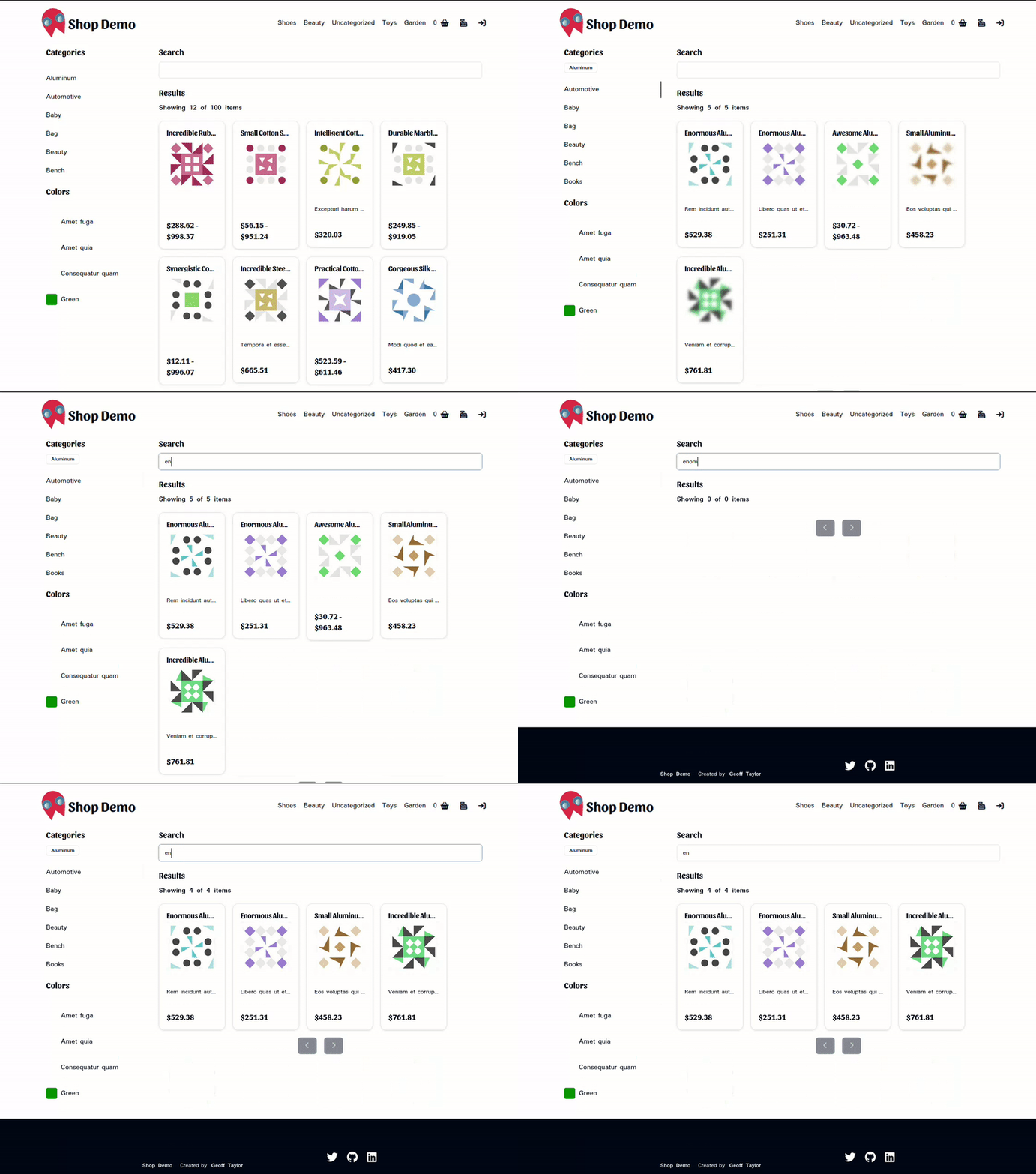
The SearchBar component allows users to search for products. The user’s input is managed with local state, and a debounce effect is used to prevent the search function from running until 500 milliseconds have passed since the user last changed their input. This can help to prevent unnecessary or premature search requests.
If you run our application, you’ll find that our shop page loads but none of the filters works. Mostly because our category, color, and page links are provided an actual URL to work with, nor are we doing anything with the SearchBar input. In Part 4 we will be building the ShopProvider component to do the job of filtering our products based upon URL and provide our filtering components with results and tools to build URLs for further interaction. Let’s proceed.
The ShopProvider component manages state and provides logic for filtering products based on search parameters such as search term, product category, color, and price range. Here’s an explanation of the core parts:
Types & Initial State: The ShopContext type defines the shape of the state managed by the ShopProvider component. initialState defines the initial values of that state.
Reducer: The reducer function takes the current state and an action, and returns the new state. For now, we only have one action type: ‘UPDATE_STATE’, which simply merges the current state with the payload of the action.
Context: We use React’s Context API to create a context and a provider component. The context allows us to share state and some helper functions across the component tree without having to manually pass props down through intermediate nodes.
Filter Products: This function applies the filters (search term, category, color, and price range) to the list of products. It also calculates the global minimum and maximum prices for the current product list.
useEffect Hook: This hook synchronizes the state with the URL query parameters. Whenever the query parameters change, it dispatches a ‘UPDATE_STATE’ action with the new state derived from the query parameters.
buildUrl Function: This function builds a new URL for the current filters. It takes an object of URL parts, merges it with the current search parameters, and builds a new URL from it. This URL can be used to navigate to the current filters’ state.
Provider: The Provider component wraps its children, providing them with access to the context. It passes the current state and helper functions to the context.
With this the ShopProvider has been added to the Shop Page. All products are passed into this provider to ensure that the entire shop has access to the state.
3. Update filter components to utilize ShopProvider:
ShopCategories, PaColorPicker, ProductListing, and SearchBar have been updated to utilize the ShopProvider. This means these components can now access the shop context, allowing them to filter products based on selected categories, colors, and search queries.
Note: the functions buildUrl and useShopContext are used across these components. The buildUrl function constructs a new URL based on changes to the filters (e.g., selected categories, colors, and search terms). useShopContext is a custom hook that provides easy access to the context managed by ShopProvider.
For instance, in the ShopCategories component, you can see that it uses the selectedCategories and buildUrl from the useShopContext hook. Whenever a category is selected, it updates the URL and hence the display of products as per the selected categories:
Similarly, the PaColorPicker, ProductListing, and SearchBar components also use the buildUrl and useShopContext hook to adjust the displayed products based on user-selected filters.
With the inclusion of these changes, your shop now boasts a centralized state management system that allows for efficient manipulation and retrieval of state throughout your application. This results in a more robust and flexible eCommerce store that is better suited to meet the needs of its users.
Part 5: Adding the Category pages.
This last part will be quick. To implement the page for the /category/* links in the TopNav define /app/[category]/page.tsx as follows:
It should be pretty obvious as to what’s going on, so without going into too much detail this page works identically to our Shop Page except no categories are provided to our Shop component for filtering and only products connected to our selected category are queried.
Conclusion
That’s it for this tutorial! You’ve now successfully created a functional Shop page with a fully functional top navigation, product listings, and filters. There’s still a lot to do though, in the next tutorial we’ll be implementing User Navigation and the Login Page. Stay tuned!